Having been really mean and done “covers that could do better“, I thought I’d attempt to be nice (which is very difficult for me) and do a pretty cover version.
So here are some books with covers to make you go ooh!
Say my name, babygirl! A book with good font or typographical decisions
Look at this gorgeousness. The font just effortlessly signals that the book is about wicked woods and magic, and the little cat hidden in the ‘o’ is perfect because you don’t even see him at first. Simple but oh, so effective.
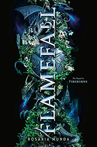
It’s not often you can get away with having the font vertical on the page but this one really works. The dragon wrapping around the ivy makes the title look like a stone column. Also, the slightly opaque castle to the side with that large expanse of black space on either side just really appeals to me. It’s beautiful.
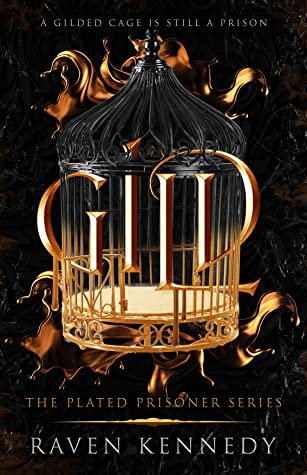
I like that the title of this one seems trapped within the bars. The word ‘gild’ is still obvious and stands out but you can see how intertwined it is with the cage. The bevelled writing gives each downward stroke the appearance of bars themselves.
Well, there’s something you don’t see every day. A book with an original cover
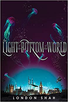
I love the juxtaposition of the beautiful jellyfish at the top of the book and the busy city below. This book was released a few years ago now but I think this is still one of my all-time favourite covers.
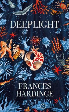
This cover has a beautiful feel about it. The deep blues and oranges really play off each other well and with that white heart as a central focal point, this book catches my eye every time.
You a boss bitch! A cover that has clearly taken some effort
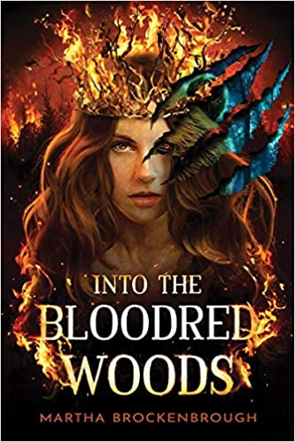
I’m going to admit that I have some trouble waiting for this one to come out. I saw it on the authors instagram feed and did such a double take I nearly gave myself whiplash. It’s not out until November but I have already set it aside for pre-ordering. The gorgeous way the blue and brown slices through the deep reds and golds is just sheer perfection. Add to that the tear marks and the two eyes staring out at you. Look how much effort has been put into this!
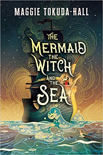
I’m not usually one for illustrated covers. I find that they somehow look childish. But this one is so well done it almost looks like a painting. The way the clouds swirl in the background and the colours of the sky match the colours that sink into the sea is really well done. it took me a long while to even notice the face in the water!
I need it in my life. A cover so pretty you have to buy it
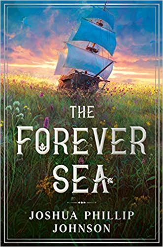
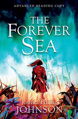
I saw it. Loved it. Bought it… they sent me the UK version which is so not as pretty. Look at it. The US version looks like a Pirate springtime. The UK version has more of an apocalyptic feel to it.
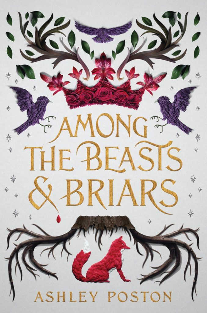
The fact that it looks hand embroidered and my hardback copy had a textured cover are really what sold it for me. I want to embroider this cover because it is so darn beautiful. I’d also love the Owlcrate cover which is dark blue with the same motif but I can’t justify the price plus shipping it would take to send it over to the UK.
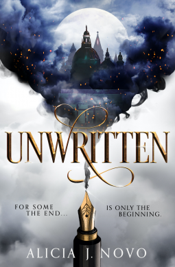
Fountain pen bleeding ink into a fantasy world? I have no idea what it is about but I want it.
Wardrobe staples. A cover beautiful in its simplicity
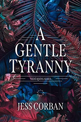
There is something about the pattern of leaves on this that just really appeals to me. It’s simple with a pretty neutral colour palette and yet it caught my eye straight away.
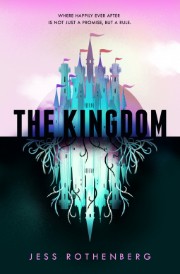
The beautiful fantasy kingdom above, the scary one below with a negative colour scheme. This cover is so simple and yet effective; it tells you so much about what to expect in the book.
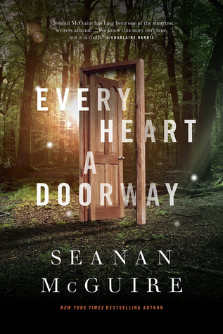
I love this series. I have been listening to them on audio and the narrator has such a soothing voice. The covers are deceptively simple yet beautiful. Every doorway takes you to a different world and it is the world that is important. So the fact that the cover shows just the simple wooden doorframe is so fitting.
Something for the whole class. A cover that others can learn from
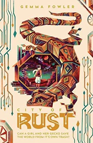
The geometric gecko. The way the font matches the side patterns and play off each other, there is not too much going on and yet you get an instant feel for the book. I really hope we get to see more covers like this.
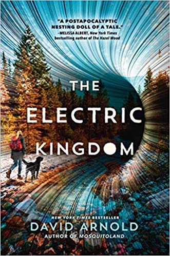
A post-apocalyptic book that doesn’t have a rundown city on the cover? Yes please. I love the way the picture is being sucked into the hole with the action lines drawing your eye inwards. Just proof that post Apocalyptic covers don’t have to be depressing!
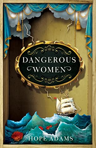
The 3D shadowbox effect makes this cover looks more like a work of arts and crafts than a flat 2D cover and I love it. I could stare at this for ages. See how much effort has gone into this. Other book covers can definitely take note.
And there we have it. Do you agree, do you not agree? What are some covers that have really impressed you?
Remember these are my opinions and meant to be taken with a pinch of sass.
Brilliant post. Nice follow-up to the ‘Covers that could do better’.
Completely agree with most of these (although I think I actually prefer the Uk version of The Forever sea – it’s the colours maybe)
My eye was especially drawn to The Kingdom, Unwritten, Rust and Dangerous Women. Hadn’t heard of most of these – so eagerly adding them to my reading list.
Thanks for the time, effort (and sass) in this post!
Thank you, the sass is free 🙂 There are some wonderful covers coming out soon so I’ll probably be doing another one of these. I’m glad you enjoyed the post.